

NOVA
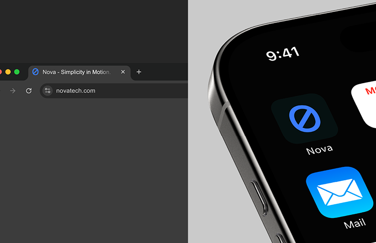
Crafting a clean, minimal brand identity for a forward-thinking digital start-up — designed to represent clarity, innovation, and modern technology.
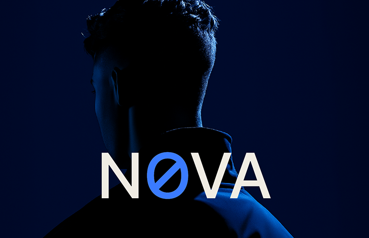
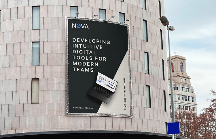
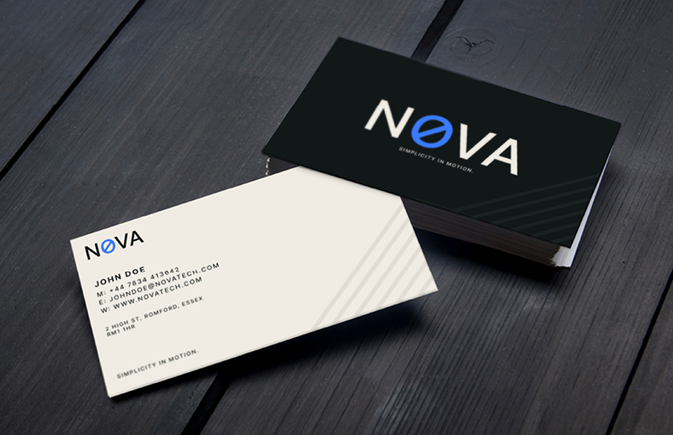
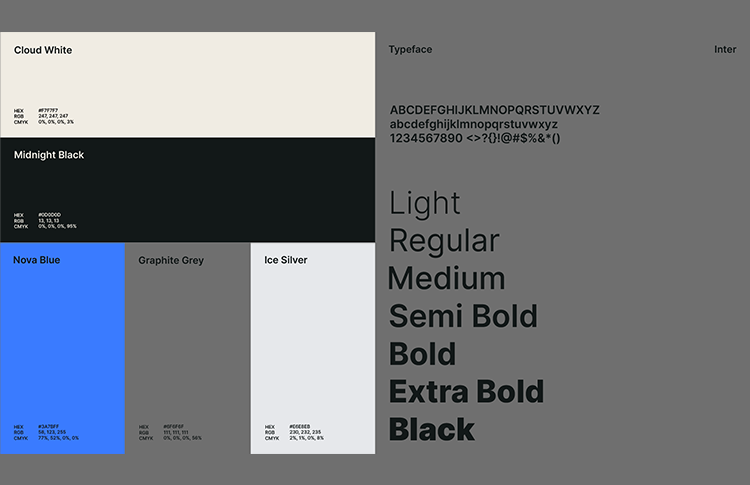

Crafting a clean, minimal brand identity for a forward-thinking digital start-up — designed to represent clarity, innovation, and modern technology.