Uplift Digital Media

Uplift Digital Media is a Colchester-based digital agency specialising in marketing, design, and development. We work with businesses of all sizes to create powerful brands, engaging websites, and tailored digital strategies that drive real results. Our goal is simple: to help your business stand out and grow online.

Contact our team today! contact@old.upliftdigital.media
Follow us
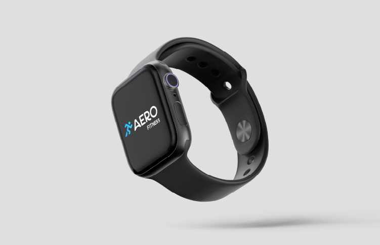
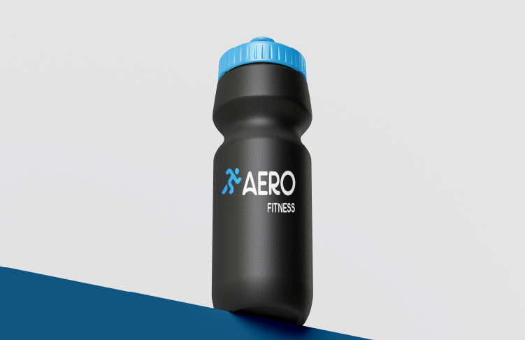
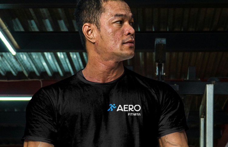
Brand Identity & Visual System

AERO

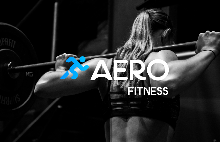
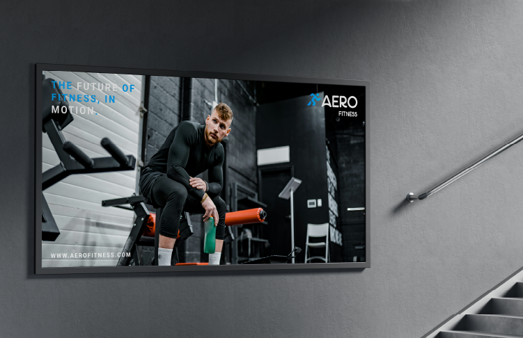
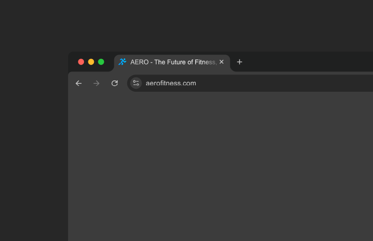
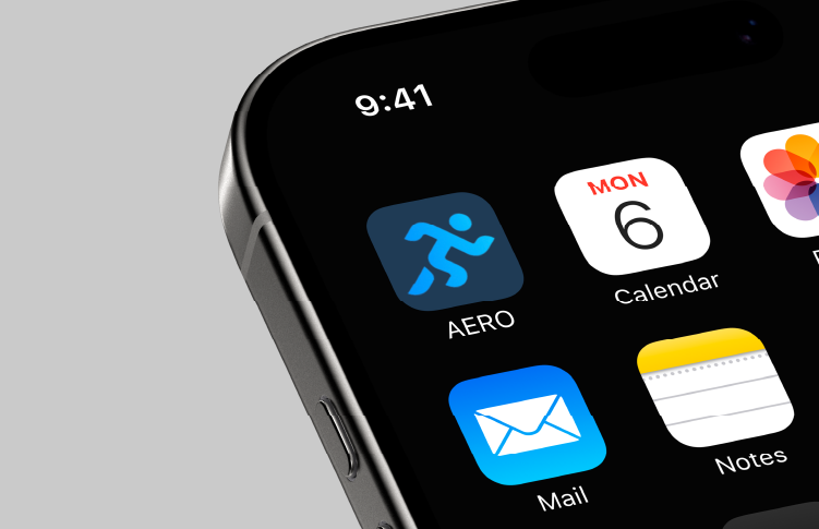
AERO partnered with Uplift Digital Media to develop a bold, modern brand identity for their fitness company. The goal was to create a clean, energetic visual system that communicates strength, movement, and a forward-focused mindset — all while reflecting the sleek, minimal aesthetic behind the AERO brand.

We designed a refined wordmark paired with a distinctive symbol inspired by motion and aerodynamics. The identity captures the essence of AERO’s approach: dynamic training, sharp precision, and a commitment to progress. With confident typography, balanced spacing, and a strong monochrome palette, the brand was crafted to feel powerful, modern, and instantly recognisable.

The final brand system blends minimal geometry with performance-driven style, ensuring consistency across apparel, digital platforms, and marketing materials. The result is a clean, high-impact identity built to elevate AERO’s presence within the fitness industry.

We delivered

We created a modern, performance-inspired brand identity that reflects AERO’s strength and movement. From logo design to visual direction, every detail was shaped to enhance clarity, impact, and versatility across all touchpoints. The final identity delivers a bold, cohesive look designed for athletes, gyms, and a growing lifestyle audience.

We worked closely with AERO to define a brand direction rooted in movement, simplicity, and confidence. Our strategy focused on creating an identity that feels premium yet accessible, ensuring the brand could adapt seamlessly across digital, print, and apparel applications.

We crafted a clean, powerful identity built around aerodynamic forms, sharp lines, and purposeful minimalism. The logo system was designed for versatility — strong enough for bold branding, refined enough for premium fitness wear.

We developed a cohesive visual approach combining structured layouts, modern typography, and a strong monochrome palette. This direction ensures the AERO brand remains impactful, consistent, and instantly recognisable across all platforms.
Need a successful project?

Lets Work Together

Contact Our Team
  • right image
  • Left Image